Mission/Purpose:
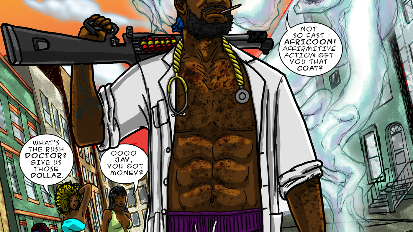
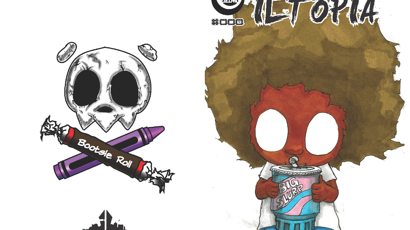
I worked with Portland State University to create a 24-page comic book for their admissions department to give out to all incoming student. The school wanted students to know many of the amenities Portland State had especially those who never took a tour of the campus. They also wanted to promote the opportunity of coming to PSU to get an education that goes beyond the classroom. Being that Portland is very influential in the comic book industry, they felt there was an opportunity to tap into a new market through a nontraditional medium for them. Also, Portland is a very “white” city. Having animated Black kids walking around Portland State would make a statement about the need for diversity and how to inspire increased access for African American students.
I worked with Portland State University to create a 24-page comic book for their admissions department to give out to all incoming student. The school wanted students to know many of the amenities Portland State had especially those who never took a tour of the campus. They also wanted to promote the opportunity of coming to PSU to get an education that goes beyond the classroom. Being that Portland is very influential in the comic book industry, they felt there was an opportunity to tap into a new market through a nontraditional medium for them. Also, Portland is a very “white” city. Having animated Black kids walking around Portland State would make a statement about the need for diversity and how to inspire increased access for African American students.
What was the role:
Creative Writing, Creative Direction, Illustration, Coloring, and Book Design.
Creative Writing, Creative Direction, Illustration, Coloring, and Book Design.
What was the process:
Met with the Vice President of student affairs, the marketing department, and admissions department to explore ideas for the book. They initially wanted a 12-page book, but after coming up with many ideas to include, they quickly doubled the scope to 24 pages. After our meetings, I went on a campus tour to see what information what being promoted already. The goal was not to create a replacement for the tour, but to add to it. I took pictures during the tour to use as references for the experience.
Met with the Vice President of student affairs, the marketing department, and admissions department to explore ideas for the book. They initially wanted a 12-page book, but after coming up with many ideas to include, they quickly doubled the scope to 24 pages. After our meetings, I went on a campus tour to see what information what being promoted already. The goal was not to create a replacement for the tour, but to add to it. I took pictures during the tour to use as references for the experience.
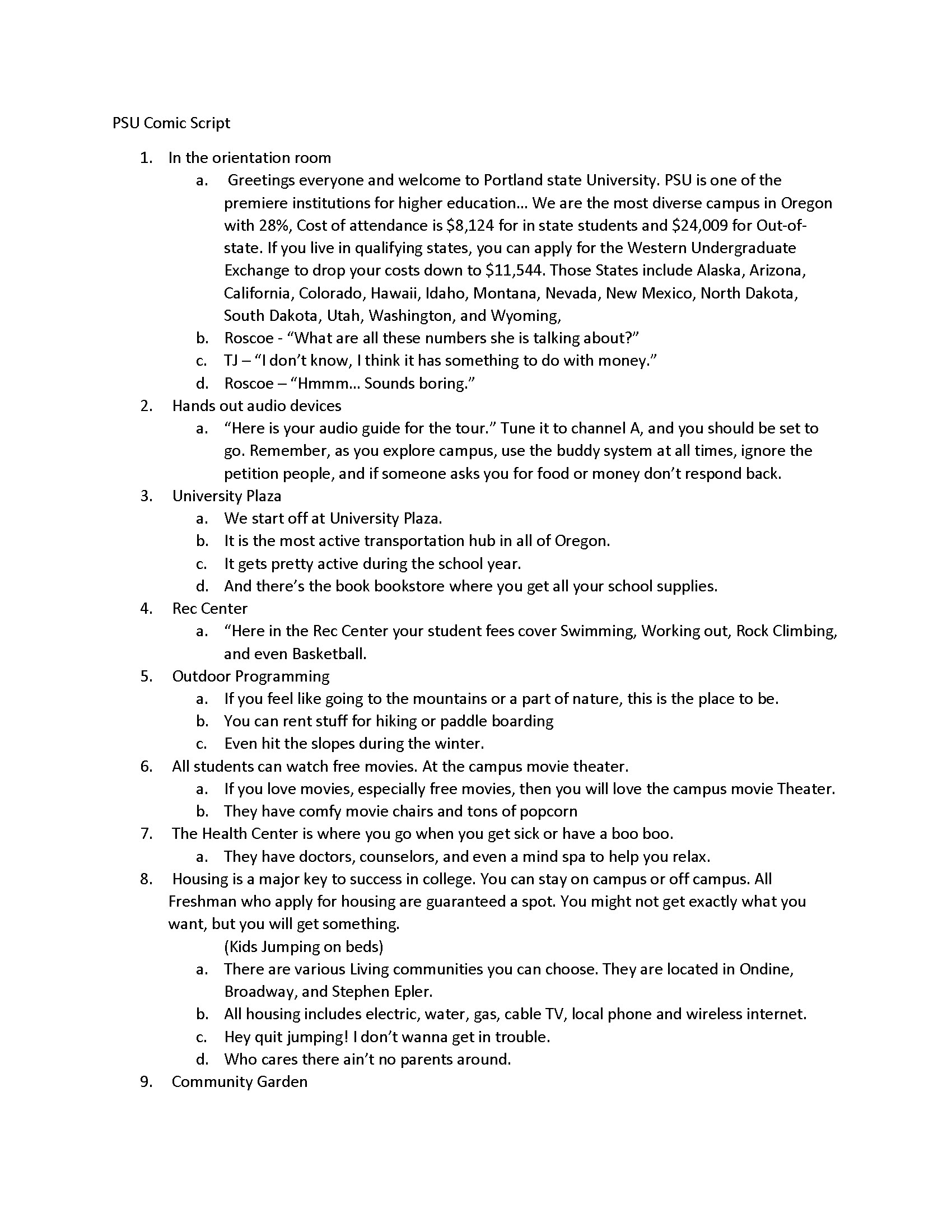
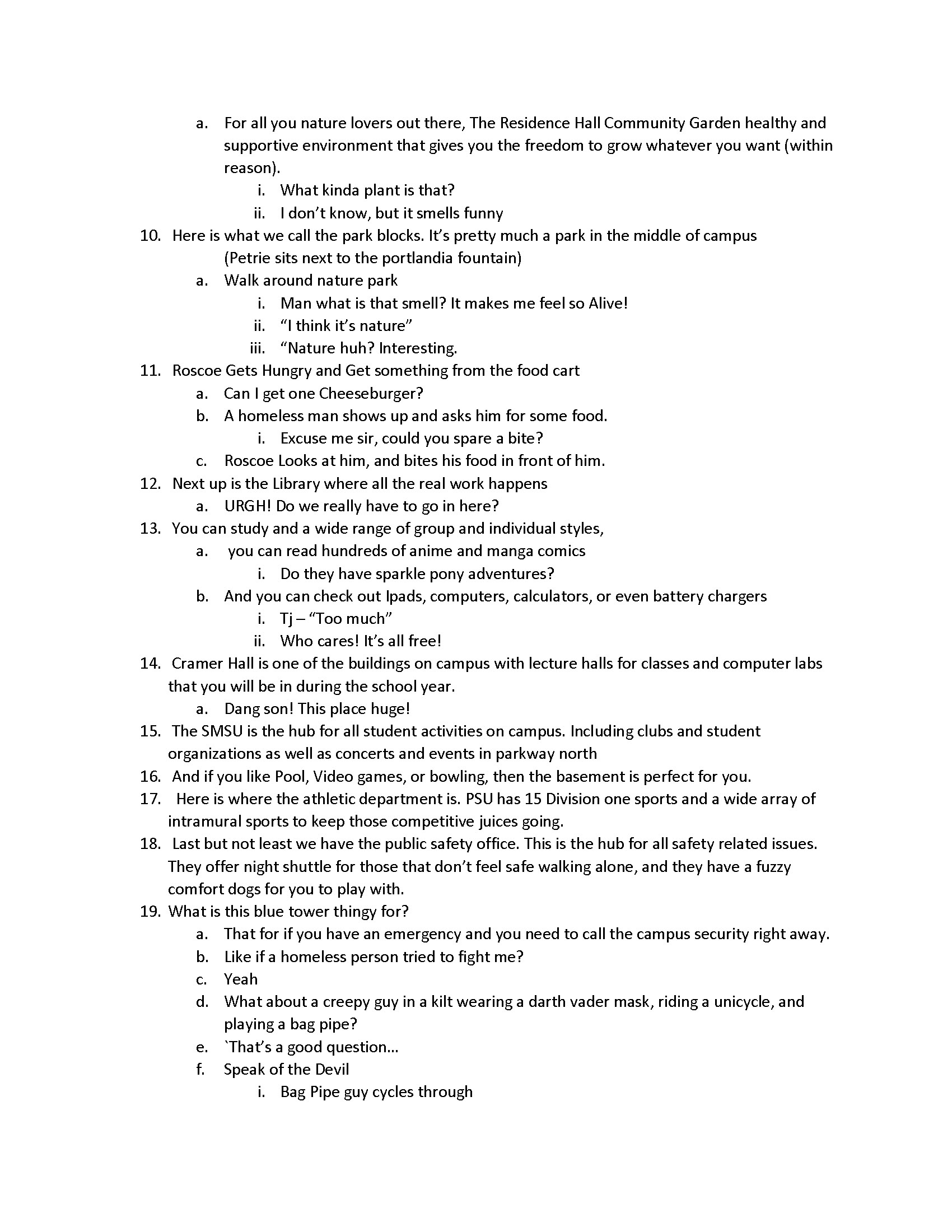
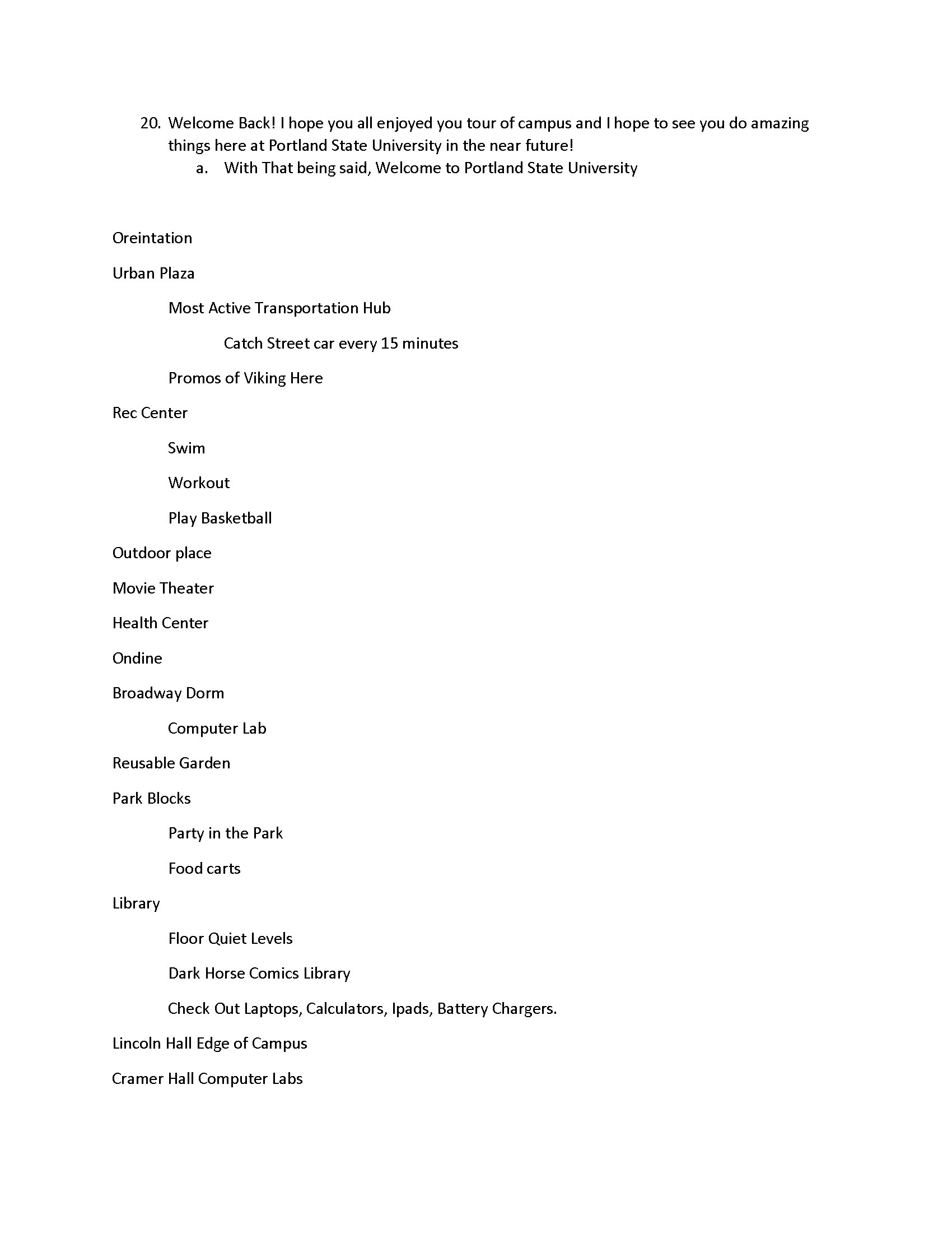
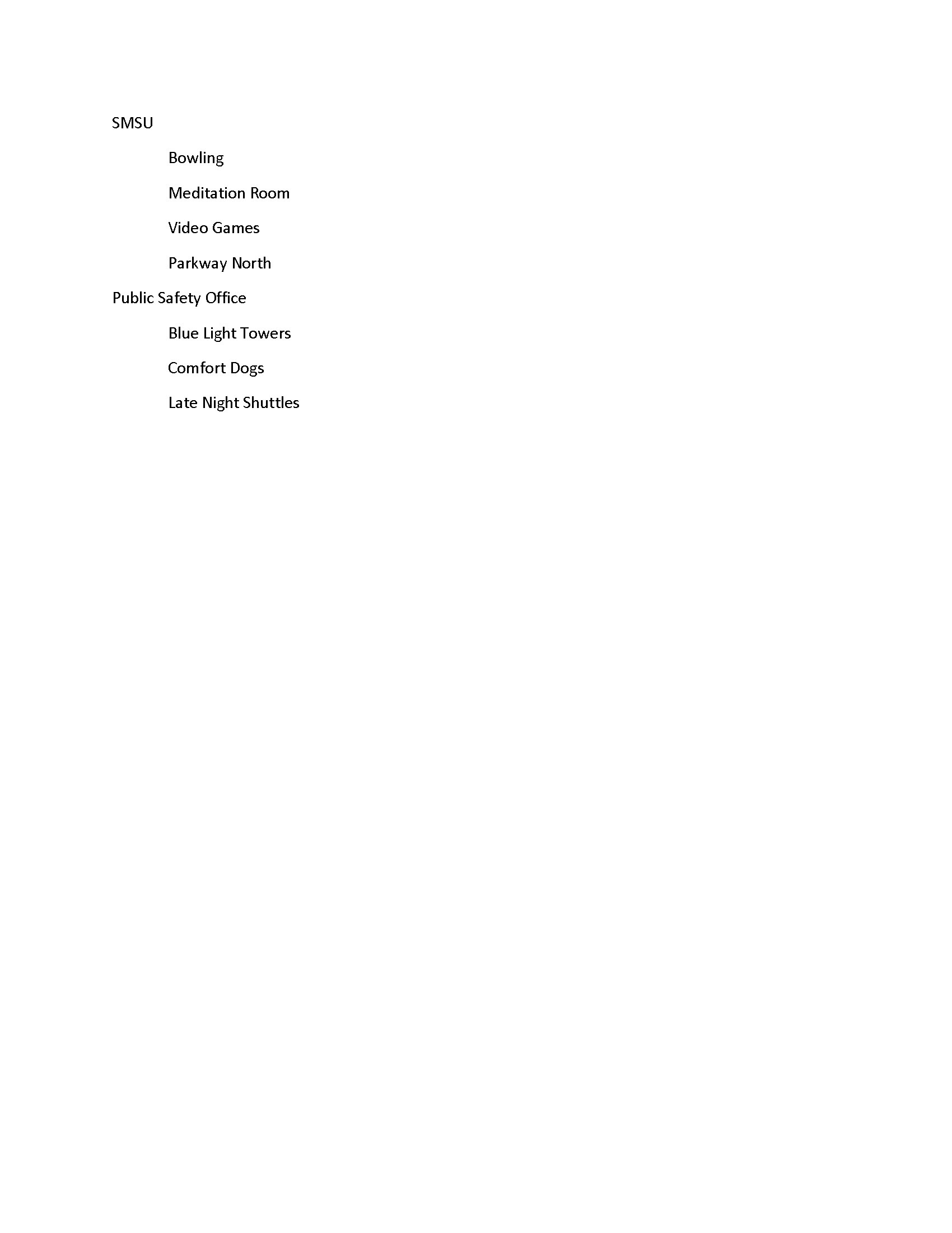
With all the ideas and references, I went through a few drafts of a script in Microsoft Word. Fine tuning details and navigating the rules PSU set in their guidelines, I created a quirky adventure with the kids from Iltopia exploring every nook and cranny of Portland State University.
I layed out many of the pages with pencil sketches and reference photos prior to sketching digitally because I wanted to have a more realistic setting compared to most of my other projects. I wanted people to see the pages and backgrounds and directly connect them to landmarks on campus. Creatively it was not as demanding, but the amount of detail in the backgrounds were more than I am usually known to add.
After the pages were mapped out in Clip Studio Paint, I did the first draft in blue digital pencil and second draft with black vector lines.
I exported the pages to Adobe Photoshop to add shading, color and all the speech bubbles.
This was a digital project, so I didn’t have to worry about print margins or rules. All in all, this project showed me the power of original ideas and filling gaps in transmitting information through creative ways. Creating an original IP give me license to do more than just draw and tell stories. I can make key connections.
