Mission/Purpose:
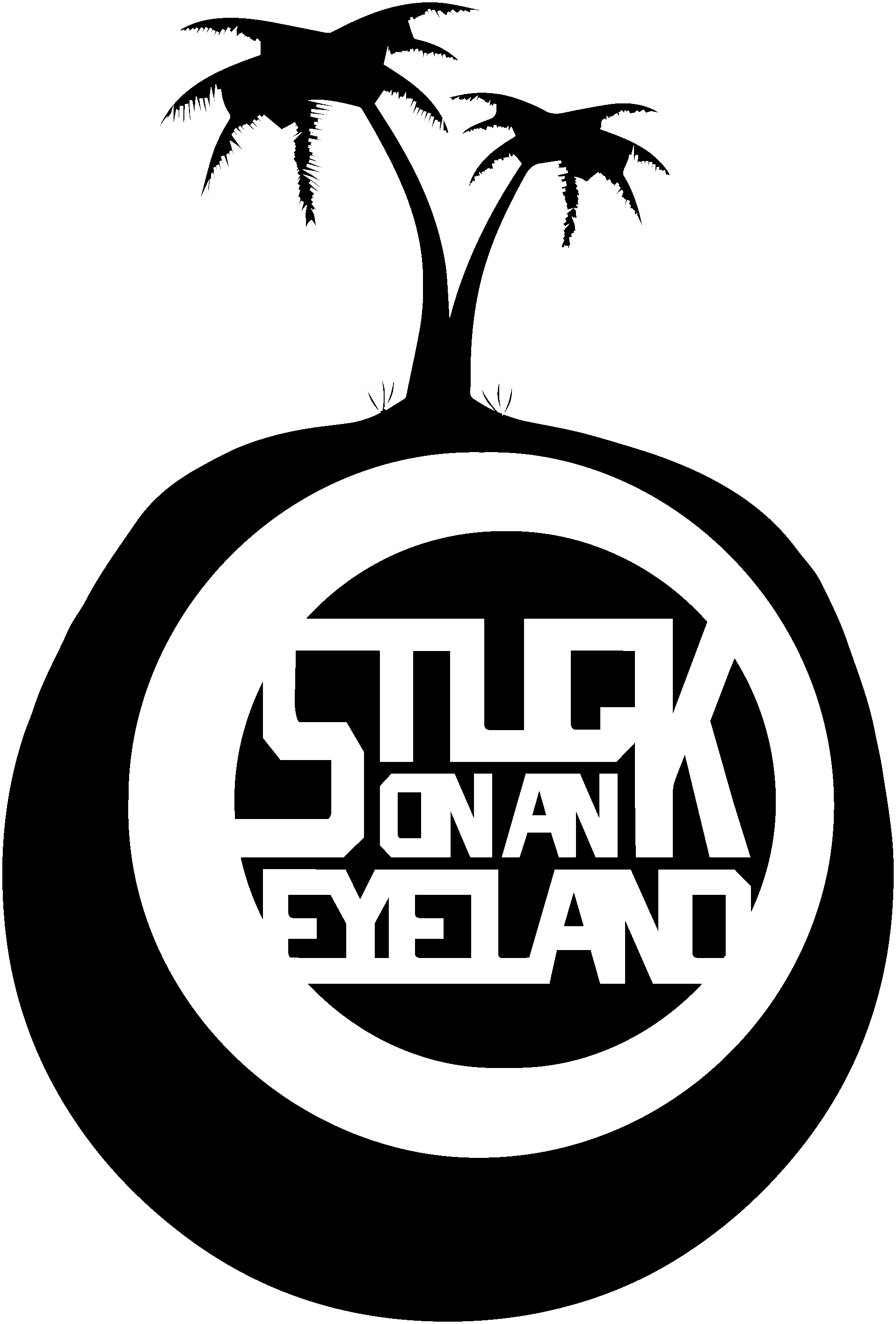
Inspired by Kendrick Lamar’s title, “Good kid mad city,” I was not a fan of his music at the time, but the title did speak to something I lived. I wanted the logo to reflect the city that raised me. I am a by product of Northern California with history in Hawaii and Oregon. I wanted to incorporate those details into it.
Inspired by Kendrick Lamar’s title, “Good kid mad city,” I was not a fan of his music at the time, but the title did speak to something I lived. I wanted the logo to reflect the city that raised me. I am a by product of Northern California with history in Hawaii and Oregon. I wanted to incorporate those details into it.
What was the role:
Branding manager, illustration, logo design.
Branding manager, illustration, logo design.
What was the process:
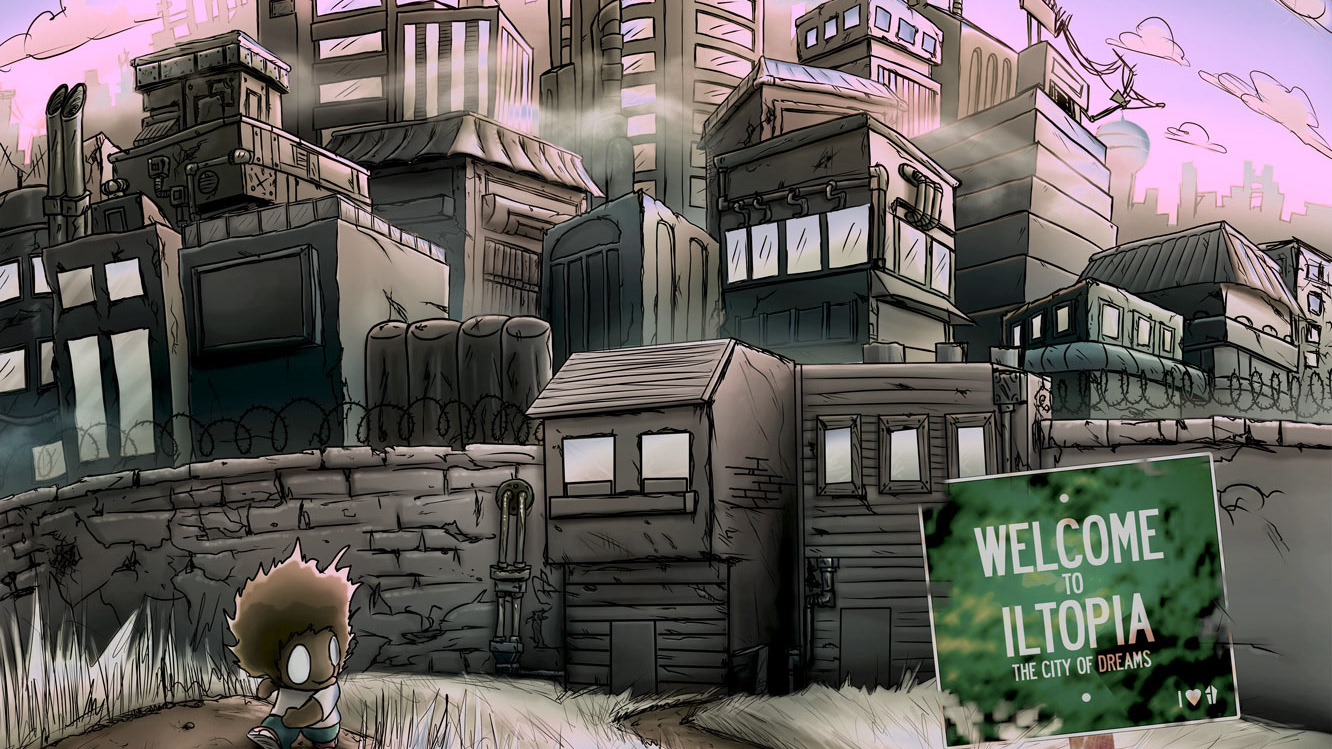
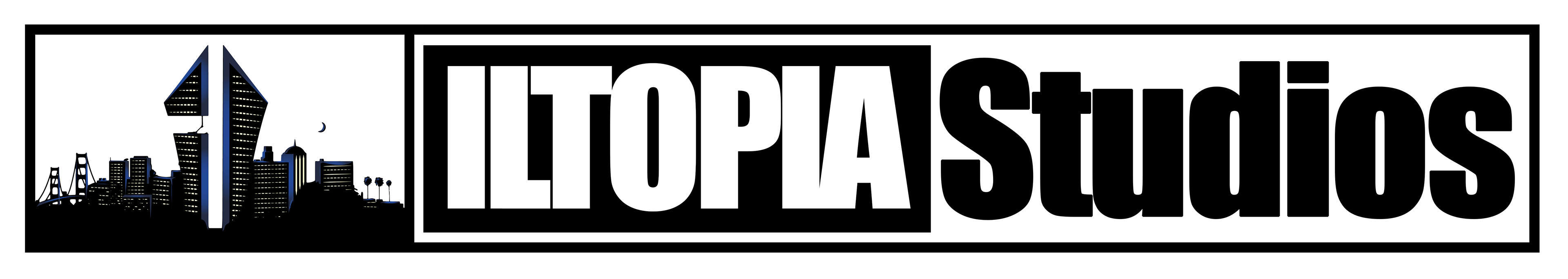
The idea of iltopia was from a rejected concept I did for my roommates clothing line “Just 2 Nice.” I pitched him the idea of making the two towers of his design more edgy and creative instead of a Roman numeral II. Obviously, he did not like the idea, so I put it on ice. When I revisited the idea, I played around with a few names: Kiljoi, Ilcity, and ultimately Iltopia. I felt it was fitting because it was a play on “utopia.” When I first got to Hawaii, I thought it was going to be a great place, a utopia, but I eventually learned that that was not the case. Combining the ills of the world with my experience in a fake utopia led me to come up with Iltopia. Best part was that I could get the domain and all the branding stuff cheap as well.
The idea of iltopia was from a rejected concept I did for my roommates clothing line “Just 2 Nice.” I pitched him the idea of making the two towers of his design more edgy and creative instead of a Roman numeral II. Obviously, he did not like the idea, so I put it on ice. When I revisited the idea, I played around with a few names: Kiljoi, Ilcity, and ultimately Iltopia. I felt it was fitting because it was a play on “utopia.” When I first got to Hawaii, I thought it was going to be a great place, a utopia, but I eventually learned that that was not the case. Combining the ills of the world with my experience in a fake utopia led me to come up with Iltopia. Best part was that I could get the domain and all the branding stuff cheap as well.
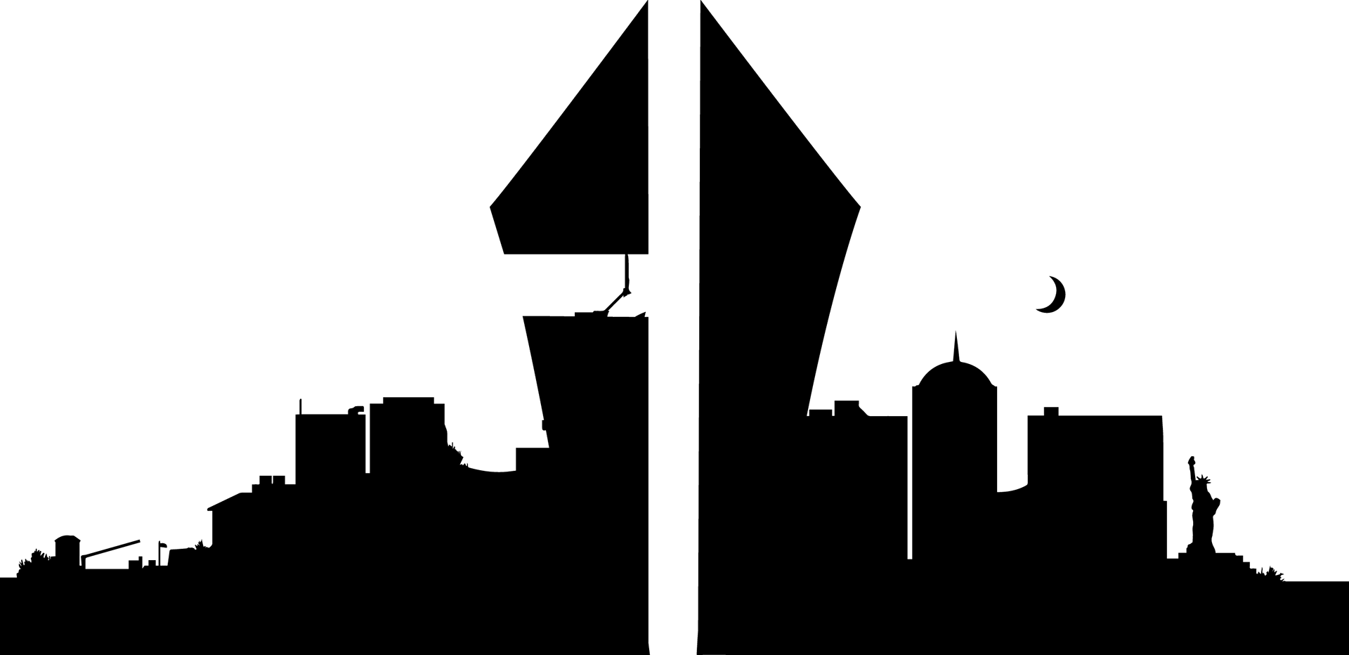
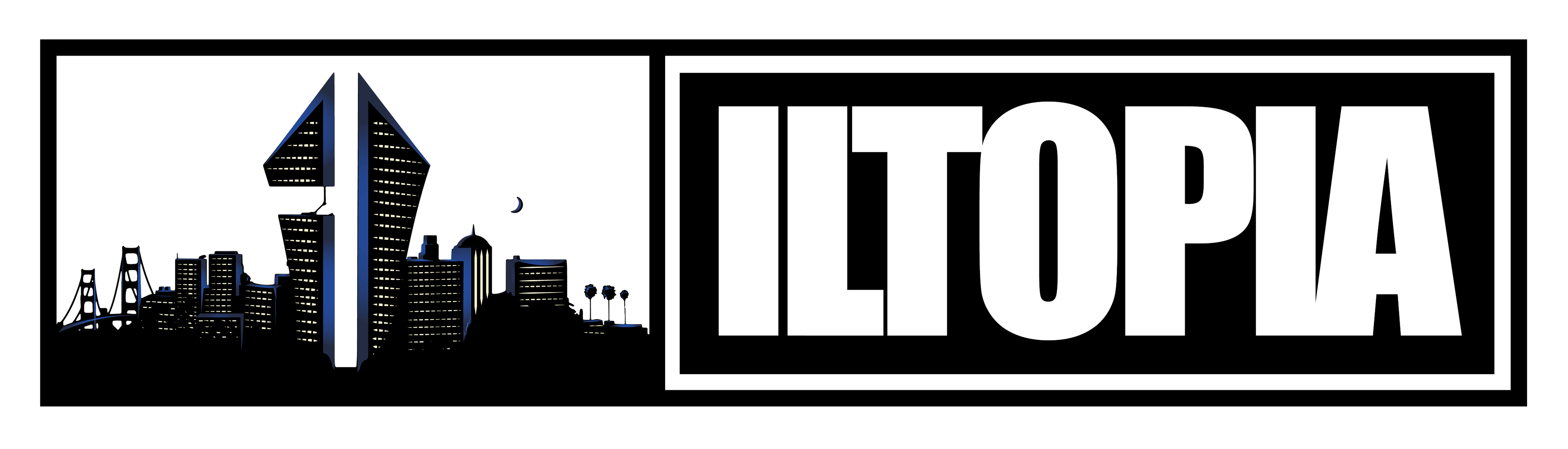
I started with the “I” and “L” and put a cityscape around it. The original design had more of a mainstream New York city feel. Skyscrapers and the statue of liberty I felt did not completely capture what I was trying to say so I added elements that spoke more to my experience.
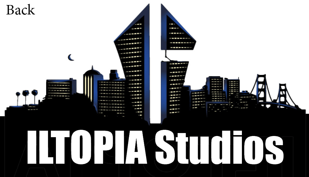
That led me to add palm trees, city buildings, and the golden gate bridge. I took the initial design and gave it some character with the window lights and blue accents.
When I incorporated Iltopia Studios, I wanted to make a statement. I wanted people to take the idea I had seriously. When most people talk about the Black experiences and experiencing microaggressions and racism, it gets dismissed and activism with no intrinsic monetary value. With Iltopia, I wanted to show that Iltopia can explore topics experienced in the “inner city” and make a profit. We aren’t some Joe blow media company; we make quality content with a purpose. This led me to make transparent business cards that focused on what lies in the city.