Mission/Purpose
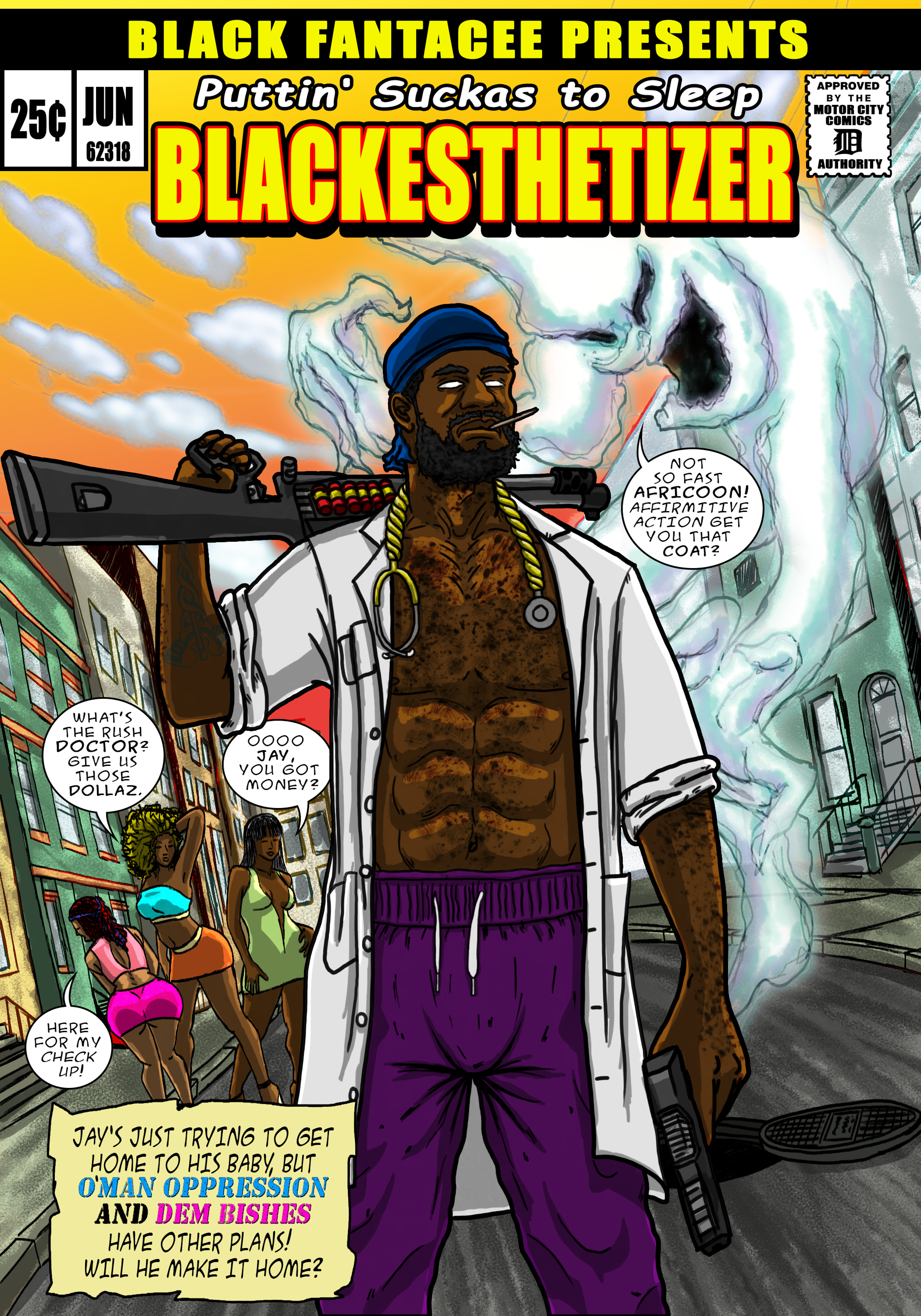
I was fortunate enough to work with one of my friends to make a comic book cover and story to celebrate her boyfriend's graduation from his Medical Residency. He is a big comic book fan, so the idea was to re-imagine him as a Blaxploitation inspired superhero like shaft to highlight his proud black identity and his influence as a medical doctor directly saving lives in his newly earned role.
I was fortunate enough to work with one of my friends to make a comic book cover and story to celebrate her boyfriend's graduation from his Medical Residency. He is a big comic book fan, so the idea was to re-imagine him as a Blaxploitation inspired superhero like shaft to highlight his proud black identity and his influence as a medical doctor directly saving lives in his newly earned role.
What was the role?
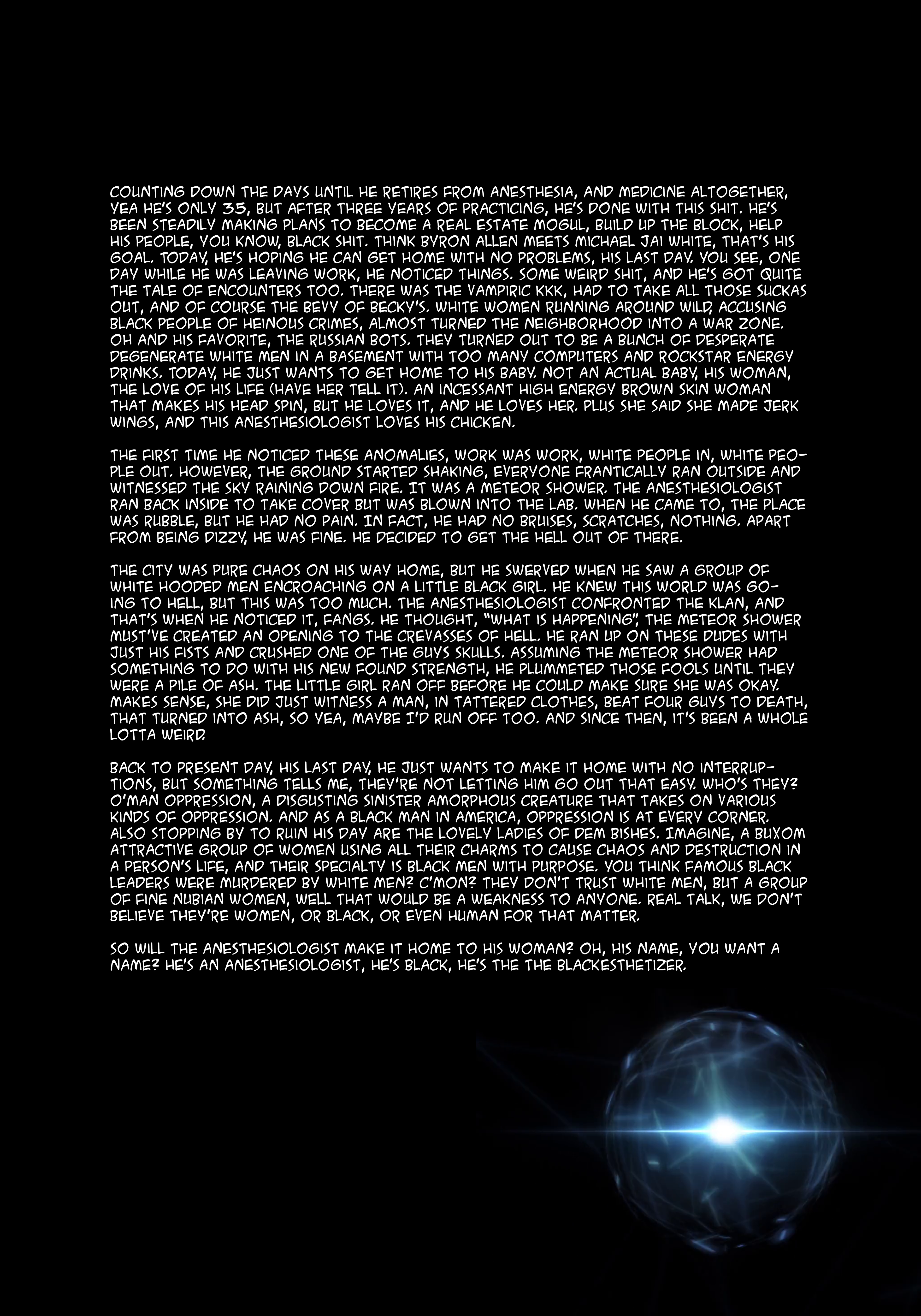
I worked with my friend to develop the concept. She wrote the back story to the character and I designed the character based on his likeness. I developed the color scheme, designed the background, and layed out the composition for the mock cover.
I worked with my friend to develop the concept. She wrote the back story to the character and I designed the character based on his likeness. I developed the color scheme, designed the background, and layed out the composition for the mock cover.
What was the process
When my friend contacted me to create a comic book cover for her boyfriend, she told me how much he loves comics. He is an artist himself, so he appreciates the artistry even though he may not have as much time to enjoy it himself. After a brief premise, she also sent me a reference image of him in his white coat and scrubs. I sat down and drafted out a rough sketch on my Samsung Note 8 with her guidance. I used a few vintage Black movie poster designs as reference for the look and feel of the composition. She wanted there to be a Shaf-esque figure in the front combating O’man Oppression with sleezy women trying to distract him in the background. Being a man of the streets, it was fitting to place him in his community.
When my friend contacted me to create a comic book cover for her boyfriend, she told me how much he loves comics. He is an artist himself, so he appreciates the artistry even though he may not have as much time to enjoy it himself. After a brief premise, she also sent me a reference image of him in his white coat and scrubs. I sat down and drafted out a rough sketch on my Samsung Note 8 with her guidance. I used a few vintage Black movie poster designs as reference for the look and feel of the composition. She wanted there to be a Shaf-esque figure in the front combating O’man Oppression with sleezy women trying to distract him in the background. Being a man of the streets, it was fitting to place him in his community.
I used Clip Studio Paint for the sketches and the line-work. The background wasn’t too bad to design since the main figure covers the composition. The difficult part was to combine the background characters and the dialogue seamlessly to achieve the goal of the story and image. I sketched out about 4-5 different poses for the main character and settled on one that seemed to fit her boyfriend the best. I thought it would be a good addition to add the medical symbol as a forearm tattoo to highlight his conviction to his craft. Being from Detroit and having a passion for hip-hop, I added gold link stethoscope around his neck. The women in the back were made from references and were the easiest part of the composition because the direction on their poses were consistent across the design process.
The final image with color in Adobe Photoshop made the whole idea come to life. My friend did a good job writing the story, and that made my job easier because it set the mood for the visual. I wanted vibrant colors to give the world created some energy. I referenced Black Dynamite and other popular black comics to figure out how I wanted to organize the title, logos, and traditional comic book stuff. Icing on the cake was creating a comics code stamp with the Detroit “D” in the top right corner. Given that this is blaxploitation inspired (him being a big fan of the genre) I wanted to give the main villain a ghouly/ghostbustery feel. An embodiment of white supremacy that continues to fester impact others in non-direct ways. I wanted the villain to feel as if he was in one place and every place looming over everyone and trying to bring them down.
Initial sketch and reference image.
